install.packages("gt")
library(gt)

install.packages("gtExtras")
library(gtExtras)

install.packages("svglite")
library(svglite)Introduction to gt Tables - 03
Making Beautiful Tables in R.
gt
tables
tidyverse
1 Introduction
Overview
In the final session of our gt tutorial series, we’ll explore how to take your tables to the next level using the gtExtras package. You’ll learn how to add sparklines, color scales, bar and density plots, and visual summaries. Additionally, you will learn how to save your polished tables as PNG, PDF, or HTML for use in reports and presentations. Let’s get started!
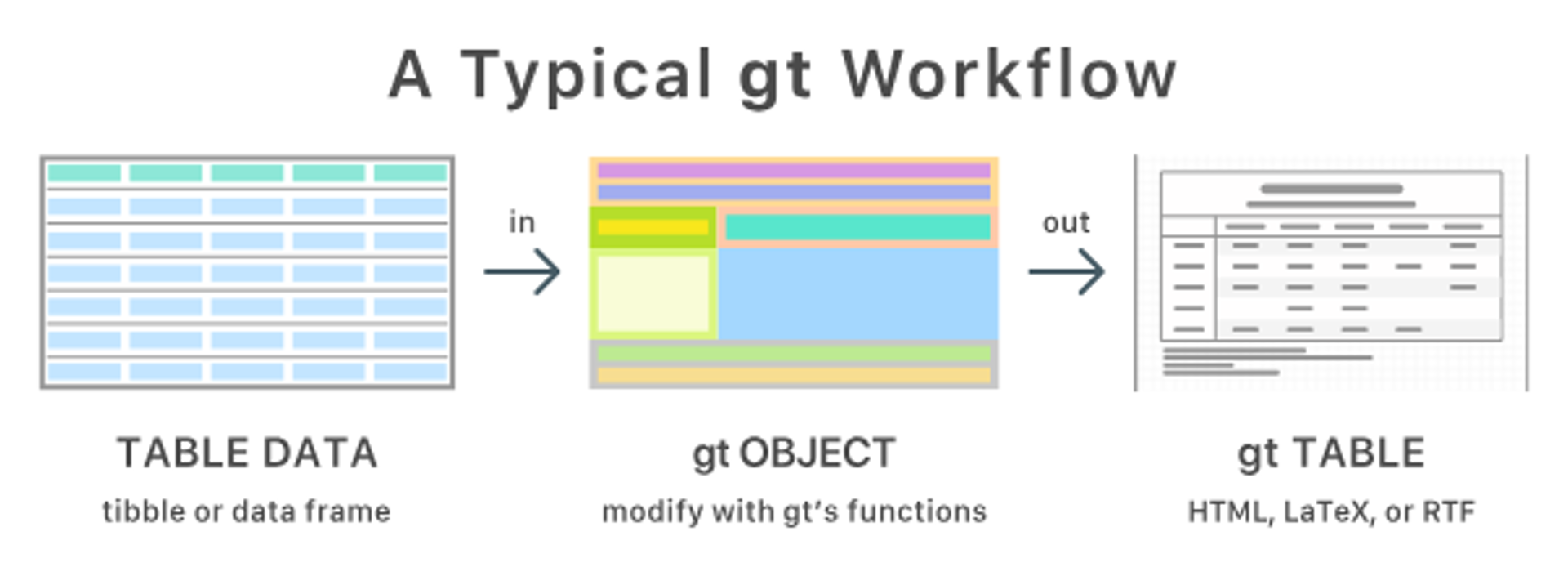
Recall the gt Tables Workflow
Please let’s go ahead and install the gt, gtExtras, and svglite package first:
2 Our data set
We will use the palmerpenguins data set

We are going to continue using our 🐧 data set from the package palmerpenguins. If you haven’t done so, please install that package first:
install.packages("palmerpenguins")palmerpenguins is a package developed by Allison Horst, Alison Hill and Kristen Gorman, including a data set collected by Dr. Kristen Gorman at the Palmer Station Antarctica, as part of the Long Term Ecological Research Network. It is a nice, relatively simple data set to practice data exploration and visualization in R.
We’ll now load the package, along with the gt and tidyverse:
# Load necessary packages
library(tidyverse)
── Attaching core tidyverse packages ──────────────────────── tidyverse 2.0.0 ──
✔ dplyr 1.1.4 ✔ readr 2.1.5
✔ forcats 1.0.0 ✔ stringr 1.5.1
✔ ggplot2 3.5.2 ✔ tibble 3.3.0
✔ lubridate 1.9.4 ✔ tidyr 1.3.1
✔ purrr 1.0.4
── Conflicts ────────────────────────────────────────── tidyverse_conflicts() ──
✖ dplyr::filter() masks stats::filter()
✖ dplyr::lag() masks stats::lag()
ℹ Use the conflicted package (<http://conflicted.r-lib.org/>) to force all conflicts to become errorslibrary(gt)
library(gtExtras)
library(svglite)
library(palmerpenguins)Once you’ve loaded that package you will have a data frame called penguins at your disposal — let’s take a look:
penguins# A tibble: 344 × 8
species island bill_length_mm bill_depth_mm flipper_length_mm body_mass_g
<fct> <fct> <dbl> <dbl> <int> <int>
1 Adelie Torgersen 39.1 18.7 181 3750
2 Adelie Torgersen 39.5 17.4 186 3800
3 Adelie Torgersen 40.3 18 195 3250
4 Adelie Torgersen NA NA NA NA
5 Adelie Torgersen 36.7 19.3 193 3450
6 Adelie Torgersen 39.3 20.6 190 3650
7 Adelie Torgersen 38.9 17.8 181 3625
8 Adelie Torgersen 39.2 19.6 195 4675
9 Adelie Torgersen 34.1 18.1 193 3475
10 Adelie Torgersen 42 20.2 190 4250
# ℹ 334 more rows
# ℹ 2 more variables: sex <fct>, year <int># Or glimpse() for a sort of transposed view, so we can see all columns:
glimpse(penguins)Rows: 344
Columns: 8
$ species <fct> Adelie, Adelie, Adelie, Adelie, Adelie, Adelie, Adel…
$ island <fct> Torgersen, Torgersen, Torgersen, Torgersen, Torgerse…
$ bill_length_mm <dbl> 39.1, 39.5, 40.3, NA, 36.7, 39.3, 38.9, 39.2, 34.1, …
$ bill_depth_mm <dbl> 18.7, 17.4, 18.0, NA, 19.3, 20.6, 17.8, 19.6, 18.1, …
$ flipper_length_mm <int> 181, 186, 195, NA, 193, 190, 181, 195, 193, 190, 186…
$ body_mass_g <int> 3750, 3800, 3250, NA, 3450, 3650, 3625, 4675, 3475, …
$ sex <fct> male, female, female, NA, female, male, female, male…
$ year <int> 2007, 2007, 2007, 2007, 2007, 2007, 2007, 2007, 2007…3 Color-Coding with gt_color_rows()
The gt_color_rows() function transforms your tables from plain data displays into intuitive visual insights by applying gradient color scales to numerical columns. This powerful feature enables readers to instantly identify patterns, outliers, and value distributions without requiring careful examination of each number, making complex data relationships immediately apparent through color intensity.
In addition to using color-coding with gt_color_rows(), we’ll also implement gt_theme() to create a consistent and professional visual style for our tables, ensuring they align with our overall design aesthetic.
# Summarize data
penguins_summary <- penguins %>%
  filter(!is.na(bill_length_mm), !is.na(flipper_length_mm), !is.na(body_mass_g)) %>%
  group_by(species) %>%
  summarize(
    Mean_Bill_Length = mean(bill_length_mm),
    Mean_Flipper_Length = mean(flipper_length_mm),
    Mean_Body_Mass = mean(body_mass_g),
    .groups = "drop"
  )

# Create styled table
penguins_summary %>%
  gt() %>%
  fmt_number(everything(), decimals = 1) %>%
  tab_header(
    title = "Penguin Species Summary",
    subtitle = "Mean values for bill length, flipper length, and body mass"
  ) %>%
  gt_theme_538() %>%
  gt_color_rows(
    columns = Mean_Bill_Length,
    palette = "ggsci::orange_material"
  )
Table has no assigned ID, using random ID 'pnaljqzuha' to apply `gt::opt_css()`
Avoid this message by assigning an ID: `gt(id = '')` or `gt_theme_538(quiet = TRUE)`| Penguin Species Summary | |||
| Mean values for bill length, flipper length, and body mass | |||
| species | Mean_Bill_Length | Mean_Flipper_Length | Mean_Body_Mass |
|---|---|---|---|
| Adelie | 38.8 | 190.0 | 3,700.7 |
| Chinstrap | 48.8 | 195.8 | 3,733.1 |
| Gentoo | 47.5 | 217.2 | 5,076.0 |
Exercise 1
Using
penguins_summary, create a similar table using a differentgt_theme(), try for instancegt_theme_nytimes()orgt_theme_dot_matrix(). Additionally, try changing the palette to “ggsci::blue_material” or “viridis”.Finally, apply the
gt_color_rows()to the three columns: Mean_Bill_Length, Mean_Flipper_Length, and Mean_Body_Mass.
Hint (click here)
Use the c() function after columns =.
Solutions (click here)
penguins_summary %>%
  gt() %>%
  fmt_number(everything(), decimals = 1) %>%
  tab_header(
    title = "Penguin Species Summary",
    subtitle = "Mean values for bill length, flipper length, and body mass"
  ) %>%
  gt_theme_538() %>%
  gt_color_rows(
    columns = c(Mean_Bill_Length, Mean_Flipper_Length, Mean_Body_Mass),
    palette = "ggsci::blue_material"
  )
Table has no assigned ID, using random ID 'blmkvlsazu' to apply `gt::opt_css()`
Avoid this message by assigning an ID: `gt(id = '')` or `gt_theme_538(quiet = TRUE)`| Penguin Species Summary | |||
| Mean values for bill length, flipper length, and body mass | |||
| species | Mean_Bill_Length | Mean_Flipper_Length | Mean_Body_Mass |
|---|---|---|---|
| Adelie | 38.8 | 190.0 | 3,700.7 |
| Chinstrap | 48.8 | 195.8 | 3,733.1 |
| Gentoo | 47.5 | 217.2 | 5,076.0 |
4 Merging and Labeling Columns
The cols_merge() and cols_label() functions provide essential tools for transforming cluttered tables into more digestible and professional displays. By strategically combining related columns and implementing clear, descriptive labels, you’ll create tables that communicate your data’s story more effectively while reducing visual complexity.
# generating the data set
penguins_stats <- penguins %>%
  filter(!is.na(sex), !is.na(bill_length_mm)) %>%
  group_by(species, sex) %>%
  summarize(
    Mean_Bill = mean(bill_length_mm),
    SD_Bill = sd(bill_length_mm),
    .groups = "drop"
  )

# Merging and labeling columns
penguins_stats %>%
  gt() %>%
  cols_merge(
    columns = c(Mean_Bill, SD_Bill),
    pattern = "{1} ± {2}"
  ) %>%
  fmt_number(columns = "Mean_Bill", decimals = 1) %>%
  fmt_number(columns = "SD_Bill", decimals = 2) %>%
  cols_label(
    species = "Species",
    sex = "Sex",
    Mean_Bill = "Mean ± SD"
  ) %>%
  tab_header(
    title = "Bill Length (mm) by Species and Sex"
  ) %>%
  tab_options(
    table.width = pct(70)
    ) %>%
  gt_theme_538()
Table has no assigned ID, using random ID 'zgljjhcoxq' to apply `gt::opt_css()`
Avoid this message by assigning an ID: `gt(id = '')` or `gt_theme_538(quiet = TRUE)`| Bill Length (mm) by Species and Sex | ||
| Species | Sex | Mean ± SD |
|---|---|---|
| Adelie | female | 37.3 ± 2.03 |
| Adelie | male | 40.4 ± 2.28 |
| Chinstrap | female | 46.6 ± 3.11 |
| Chinstrap | male | 51.1 ± 1.56 |
| Gentoo | female | 45.6 ± 2.05 |
| Gentoo | male | 49.5 ± 2.72 |
Exercise 2
Create the same table we produced earlier with the
penguins_statsdata set. This time, format all column labels and the heading in BOLD to enhance readability.Format both the mean and standard deviation values to display with 1 decimal place (using
decimals = 1). Instead of specifying each column individually, use theends_with()function to select and format all relevant columns at once.
Solutions (click here)
penguins_stats %>%
  gt() %>%
  cols_merge(
    columns = c(Mean_Bill, SD_Bill),
    pattern = "{1} ± {2}"
  ) %>%
  fmt_number(columns = ends_with("Bill"), decimals = 1) %>%
  cols_label(
    species = md("**Species**"),
    sex = md("**Sex**"),
    Mean_Bill = md("**Mean ± SD**")
  ) %>%
  tab_header(
    title = md("**Bill Length (mm) by Species and Sex**")
  ) %>%
  tab_options(
    table.width = pct(70)
    ) %>%
gt_theme_nytimes()| Bill Length (mm) by Species and Sex | ||
| Species | Sex | Mean ± SD |
|---|---|---|
| Adelie | female | 37.3 ± 2.0 |
| Adelie | male | 40.4 ± 2.3 |
| Chinstrap | female | 46.6 ± 3.1 |
| Chinstrap | male | 51.1 ± 1.6 |
| Gentoo | female | 45.6 ± 2.1 |
| Gentoo | male | 49.5 ± 2.7 |
5 Add Inline Bar Plots with gt_plt_bar_pct()
The gt_plt_bar_pct() function transforms ordinary numeric data into compelling visual elements by embedding miniature bar charts directly alongside your values. These inline visualizations instantly communicate proportional relationships within your data, allowing readers to grasp relative magnitudes at a glance without the need for mental calculations or separate charts.
penguins %>%
  count(species, island) %>%
  group_by(island) %>%
  mutate(prop = n / sum(n)) %>%
  gt() %>%
  gt_plt_bar_pct(column = prop, labels = TRUE) %>%
  tab_header(
    title = "Species Proportions by Island",
    subtitle = "Inline bar chart with percentage labels"
)| Species Proportions by Island | ||
| Inline bar chart with percentage labels | ||
| species | n | prop |
|---|---|---|
| Biscoe | ||
| Adelie | 44 |
26.2%
|
| Gentoo | 124 |
73.8%
|
| Dream | ||
| Adelie | 56 |
45.2%
|
| Chinstrap | 68 |
54.8%
|
| Torgersen | ||
| Adelie | 52 |
100%
|
6 Add Sparklines with gt_plt_sparkline()
The gt_plt_sparkline() function elevates your tables by embedding miniature data visualizations directly within cells, allowing readers to grasp trends and distributions at a glance without separate charts. These compact graphical elements provide powerful contextual information alongside your numeric data, transforming static tables into dynamic, information-rich displays that reveal patterns that might otherwise remain hidden in rows of numbers.
penguins %>%
  filter(!is.na(flipper_length_mm)) %>%
  group_by(species, island) %>%
  summarise(flipper_mean = mean(flipper_length_mm),
            flipper_dist = list(flipper_length_mm), .groups = "drop") %>%
  gt() %>%
  fmt_number(flipper_mean, decimals = 1) %>%
  gt_plt_sparkline(flipper_dist) %>%
  tab_header(
    title = "Flipper Length Distribution",
    subtitle = "Sparklines show data spread by species and island"
)| Flipper Length Distribution | |||
| Sparklines show data spread by species and island | |||
| species | island | flipper_mean | flipper_dist |
|---|---|---|---|
| Adelie | Biscoe | 188.8 | |
| Adelie | Dream | 189.7 | |
| Adelie | Torgersen | 191.2 | |
| Chinstrap | Dream | 195.8 | |
| Gentoo | Biscoe | 217.2 | |
7 Add density plots with gt_plt_dist()
The gt_plt_dist() function elevates your tables by embedding compact density plots directly alongside your numeric data, providing immediate visual context for distributions. These inline visualizations allow readers to quickly grasp the shape and spread of your data without needing to reference separate charts, creating a more comprehensive and insightful table that combines both precise values and their distributional patterns.
penguins %>% filter(!is.na(flipper_length_mm), !is.na(body_mass_g), !is.na(species)) %>%
  group_by(species) %>%
  summarise(
    dist = list(body_mass_g)
  ) %>%
  gt() %>%
  gt_plt_dist(dist, type = "density", fill = "lightblue") %>%
  cols_label(
    dist = "Density Plot"
  ) %>%
tab_header(title = "Average Body Mass and Distribution")| Average Body Mass and Distribution | |
| species | Density Plot |
|---|---|
| Adelie | |
| Chinstrap | |
| Gentoo | |
Exercise 3
- Create a table displaying the average body mass (in grams and one decimal place) for each of the three penguin species, accompanied by density plots that visualize the distribution of mass values. This combination will allow for both precise numeric comparison and visual analysis of how the masses are distributed within each species.
Solutions (click here)
table_density <-  penguins %>% filter(!is.na(flipper_length_mm), !is.na(body_mass_g), !is.na(species)) %>%
  group_by(species) %>%
  summarise(
    avg_mass = mean(body_mass_g),
    dist = list(body_mass_g)
  ) %>%
  gt() %>%
  fmt_number(columns = avg_mass, decimals = 1) %>%
  gt_plt_dist(dist, type = "density", fill = "lightblue") %>%
  cols_label(
    species = "Species",
    avg_mass = "Avg Mass (g)",
    dist = "Density Plot"
  ) %>%
  tab_header(title = "Average Body Mass and Distribution")
8 SAVE YOUR TABLE
Make sure the following packages are installed:
install.packages("webshot2")
library(webshot2)
# SAVE AS .PNG
gtsave(table_density, "table_density.png")
# SAVE AS .PDF
gtsave(table_density, "table_density.pdf")
# SAVE AS .HTML
gtsave(table_density, "table_density.html")
# BONUS - saving multiple formats in one go:
walk(
c("png", "pdf", "html"),
~gtsave(table_density, filename = paste0("table_density.", .x))
)