if (! require(tidyverse)) install.packages("tidyverse")
if (! require(maps)) install.packages("maps")
if (! require(sf)) install.packages("sf")Making maps in R: part III
Making choropleth maps and interactive maps
maps
Today is the third and last of a series of Code Club sessions on making maps with R.
In the first session, we learned the basics of making and formatting maps with ggplot functions.
In the second session, we learned how to add markers/points and text to maps.
Today, we will learn how to make maps…
with different fill colors for different areas — so-called choropleth maps.
that are interactive and zoomable.
(While exploring this topic, I ended up making more material than we can cover so there is also some at-home reading bonus content covering detailed map backgrounds with ggmap, and county-level choropleth maps.)
1 Setting up
Installing and loading R packages
We will start by loading (and if necessary, first installing) the packages that we also used in the past two weeks.
Recall that we are using ggplot2 from the tidyverse to make maps, but that we also needs the maps and sf packages for some of the geospatial functions in ggplot2 to work — and the maps package also contains some base maps data that we’ve been using.
library(maps)
library(sf)
library(tidyverse)
Today, we will additionally use:
- State-level statistics from the usdata (as in: US data) package
- The mapview package to make interactive maps
- The scico package for some new color palettes
- The rebird package to access recent bird sightings from Ebird
if (! require(scico)) install.packages("scico")
if (! require(usdata)) install.packages("usdata")
if (! require(mapview)) install.packages("mapview")
if (! require(rebird)) install.packages("rebird")library(scico)
library(usdata)
library(mapview)
library(rebird)Setting a plot theme
Like in the past two weeks, we’ll set a ggplot theme for all our plots:
theme_set(theme_void())
theme_update(legend.position = "top")
2 A first choropleth map
In choropleth maps, the fill color of a geographic area is based on the value of a variable — think of, for example, population density, median income, mean temperature, or biodiversity.
For example, the map below shows median annual income across states (we will make this one in a few minutes):
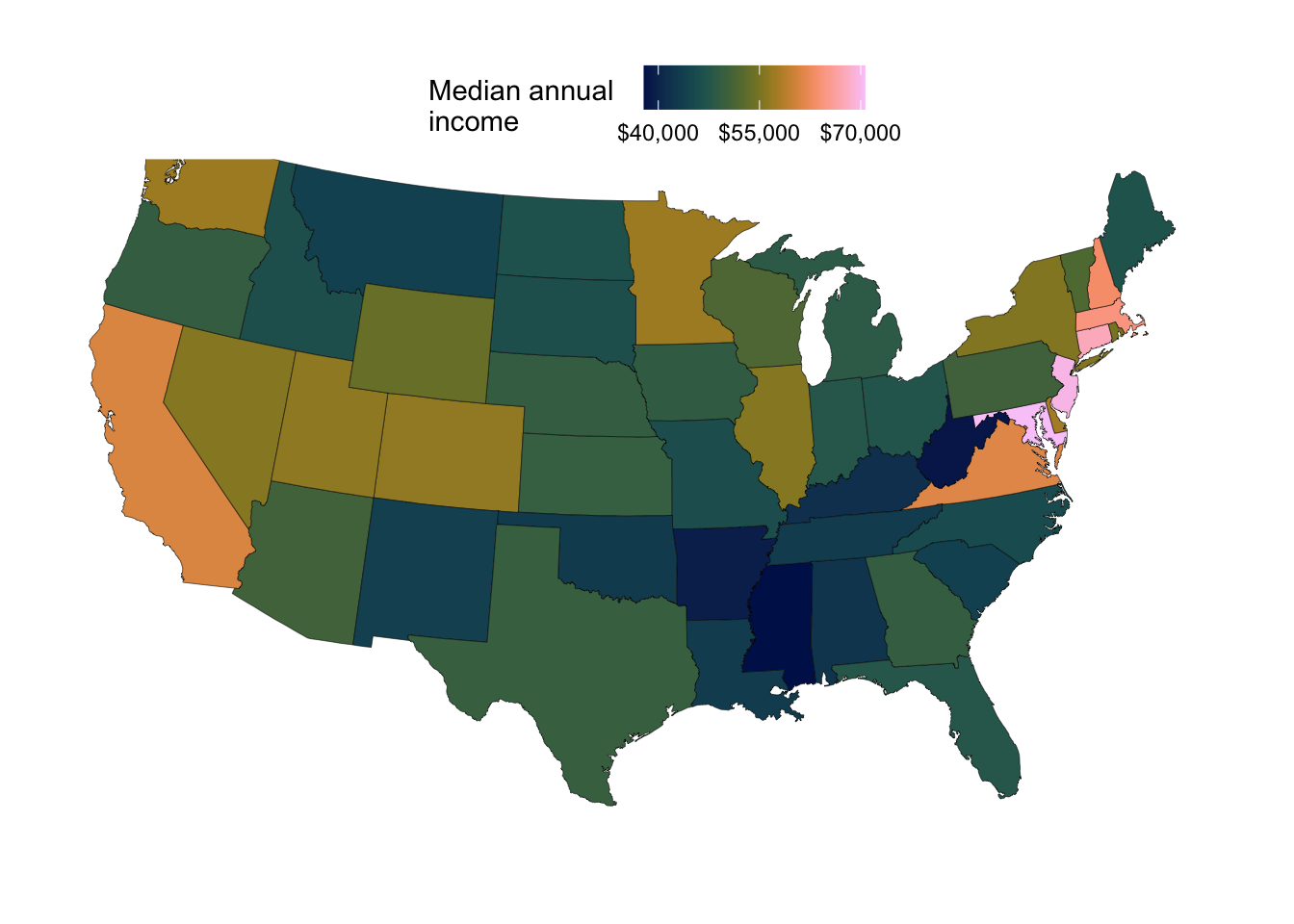
In ggplot-speak, to do this, we will be mapping the fill aesthetic to this variable of interest, which should represent a column in our input dataframe.
To get started, we’ll get the state-level base map dataframe we’ve used before, and make some slight modifications:
state_map <- map_data(map = "state") |>
  # Rename the 'region' column to 'state' for clarity:
  rename(state = region) |>
  # Capitalize the first letter of state names:
  mutate(state = tools::toTitleCase(state)) |>
  # Turn into a tibble for better printing:
  tibble()

head(state_map)
# A tibble: 6 × 6
long lat group order state subregion
<dbl> <dbl> <dbl> <int> <chr> <chr>
1 -87.5 30.4 1 1 Alabama <NA>
2 -87.5 30.4 1 2 Alabama <NA>
3 -87.5 30.4 1 3 Alabama <NA>
4 -87.5 30.3 1 4 Alabama <NA>
5 -87.6 30.3 1 5 Alabama <NA>
6 -87.6 30.3 1 6 Alabama <NA> For our first choropleth map, we will only use the above base map dataframe, which does not contain additional data about states. But we can simply give each state a unique color by mapping the fill aesthetic to region, the column that contains the state names:
# We'll just plot 3 states and pre-filter the dataset:
three_state_map <- state_map |>
  filter(state %in% c("Ohio", "Indiana", "Michigan"))

ggplot(three_state_map) +
  geom_polygon(aes(x = long, y = lat, group = group, fill = state)) +
  coord_sf()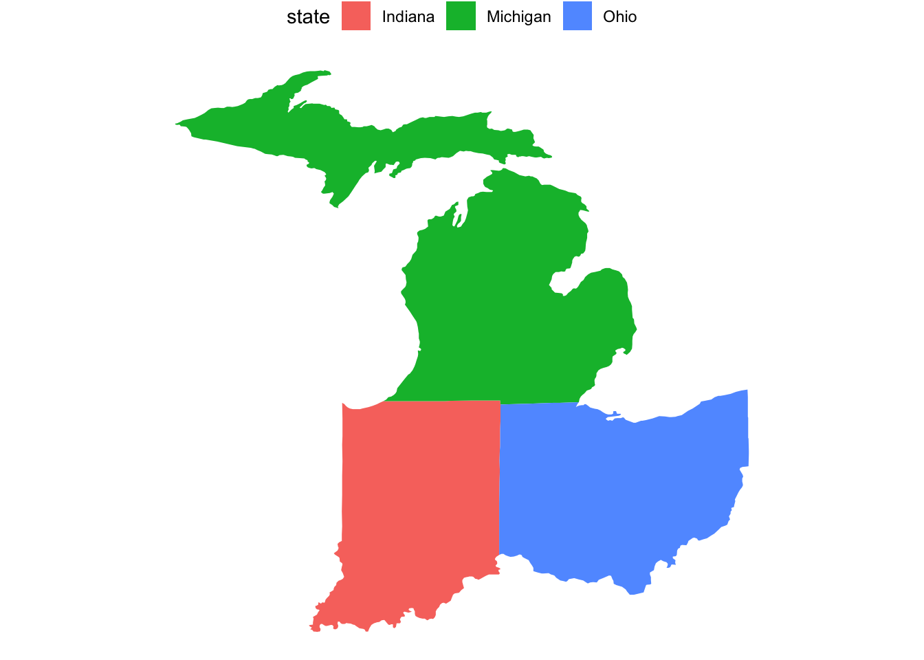
While this map is not too interesting, for some maps, showing the names of regions in this way can be a useful alternative to adding text labels in the map itself.
In the next sections, we’ll pull in some data to make more interesting choropleth maps.
3 State-level choropleth maps
The state_stats dataset
We’ll use the state_stats dataframe that is available after loading the usdata package — let’s take a look at that:
head(state_stats)# A tibble: 6 × 24
state abbr fips pop2010 pop2000 homeownership multiunit income med_income
<fct> <fct> <dbl> <dbl> <dbl> <dbl> <dbl> <dbl> <dbl>
1 Alabama AL 1 4.78e6 4.45e6 71.1 15.5 22984 42081
2 Alaska AK 2 7.10e5 6.27e5 64.7 24.6 30726 66521
3 Arizona AZ 4 6.39e6 5.13e6 67.4 20.7 25680 50448
4 Arkansas AR 5 2.92e6 2.67e6 67.7 15.2 21274 39267
5 Califor… CA 6 3.73e7 3.39e7 57.4 30.7 29188 60883
6 Colorado CO 8 5.03e6 4.30e6 67.6 25.6 30151 56456
# ℹ 15 more variables: poverty <dbl>, fed_spend <dbl>, land_area <dbl>,
# smoke <dbl>, murder <dbl>, robbery <dbl>, agg_assault <dbl>, larceny <dbl>,
# motor_theft <dbl>, soc_sec <dbl>, nuclear <dbl>, coal <dbl>,
# tr_deaths <dbl>, tr_deaths_no_alc <dbl>, unempl <dbl>That’s a lot of columns with data! For such wide dataframes, the View() function is particularly useful to explore the data:
# [The output is not shown on the website,
#  but this will open a spreadsheet-like tab in RStudio with the data]
View(state_stats)
And if you’re wondering what some of these columns mean, we can check the help page for this data set as follows:
# [The output is not shown on the website,
#  but this will open a help page in the Help tab.]
?state_stats
Merging the data with our base map data
Next, we will merge our base map dataframe (state_map) with the state_stats dataframe.
Specifically, we’ll want to add the state_stats dataframe’s columns (which has 1 row per state) to each row of our state_map dataframe (which has multiple rows per state, all of which we’ll need to keep) for the appropriate state. That is, the Ohio statistics from state_stats should be added to each row of state_map, and so on for each state.
Combining dataframes using a shared column (or “key”) can be done with the _join() family of functions. Let’s first make sure that the state names are styled the same way in both dataframes:
head(state_stats$state)[1] Alabama Alaska Arizona Arkansas California Colorado
52 Levels: Alabama Alaska Arizona Arkansas California Colorado ... Wyoming# (Use unique() for this dataframe since state names are repeated:)
head(unique(state_map$state))[1] "Alabama" "Arizona" "Arkansas" "California" "Colorado"
[6] "Connecticut"
TipWant to check if both data sets contain the exact same set of states? (Click to expand)
You may want to more carefully check that your datasets match — the setequal() function will test whether two vectors contain the exact same unique set of values (regardless of the order of appearance, or of repeated values):
setequal(state_map$state, state_stats$state)[1] FALSEHmmm … so these two data frames somehow do not contain the same set of states (or perhaps there’s a spelling difference somewhere).
We can use the setdiff() function to let us know which values (in our case, state names) are present in a first vector but not in a second — this is one-directional/asymmetric, so we’ll want to check both directions like so:
# Are any states only present in `state_map`?
setdiff(state_map$state, state_stats$state)character(0)# Are any states only present in `state_stats`?
setdiff(state_stats$state, state_map$state)[1] "Alaska" "Hawaii"It turns out that the state_stats dataframe contains Alaska and Hawaii while our state_map, as we’ve seen before, only contain the Lower 48 set of states.
That looks good — you’ll notice that one is a factor and the other of type character, but this will not pose a problem. We’ll therefore proceed to combine the dataframes, using the left_join() function with state_map as the focal (left-hand side) dataframe, so that all its rows will be kept:
state_map_with_stats <- state_map |>
  left_join(state_stats, by = "state")

head(state_map_with_stats)
# A tibble: 6 × 29
long lat group order state subregion abbr fips pop2010 pop2000
<dbl> <dbl> <dbl> <int> <chr> <chr> <fct> <dbl> <dbl> <dbl>
1 -87.5 30.4 1 1 Alabama <NA> AL 1 4779736 4447100
2 -87.5 30.4 1 2 Alabama <NA> AL 1 4779736 4447100
3 -87.5 30.4 1 3 Alabama <NA> AL 1 4779736 4447100
4 -87.5 30.3 1 4 Alabama <NA> AL 1 4779736 4447100
5 -87.6 30.3 1 5 Alabama <NA> AL 1 4779736 4447100
6 -87.6 30.3 1 6 Alabama <NA> AL 1 4779736 4447100
# ℹ 19 more variables: homeownership <dbl>, multiunit <dbl>, income <dbl>,
# med_income <dbl>, poverty <dbl>, fed_spend <dbl>, land_area <dbl>,
# smoke <dbl>, murder <dbl>, robbery <dbl>, agg_assault <dbl>, larceny <dbl>,
# motor_theft <dbl>, soc_sec <dbl>, nuclear <dbl>, coal <dbl>,
# tr_deaths <dbl>, tr_deaths_no_alc <dbl>, unempl <dbl>Great! We can see that the data from state_stats has been added to our base map dataframe. Now, we can use this dataframe to plot the states along with this data.
A choropleth map showing median income across states
There are a number of variables (statistics) in our dataframe that we may want to visualize. Let’s start with the med_income column, which is median annual income:
ggplot(state_map_with_stats) +
  geom_polygon(aes(x = long, y = lat, group = group, fill = med_income)) +
  coord_sf(crs = 5070, default_crs = 4326)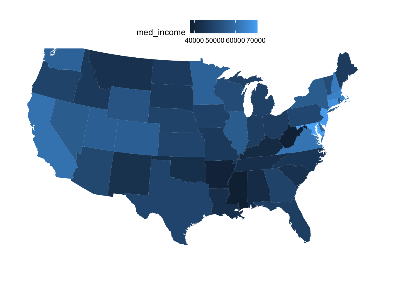
We can make some improvements in the formatting of this map:
p_income <- ggplot(state_map_with_stats) +
  geom_polygon(
    aes(x = long, y = lat, group = group, fill = med_income),
    # We'll use black state outlines with thine lines:
    color = "black",
    linewidth = 0.1,
  ) +
  # The 'viridis' continuous ('_c') color schemes often look good:
  scale_fill_viridis_c(
    # You can include a line break in the legend title with '\n':
    name = "Median annual  \nincome",
    # You can use include $ signs in the legend labels like so:
    labels = scales::label_currency(),
    # We'll use fewer breaks to avoid label overlap:
    breaks = c(40, 55, 70) * 1000
    ) +
  coord_sf(crs = 5070, default_crs = 4326)

p_income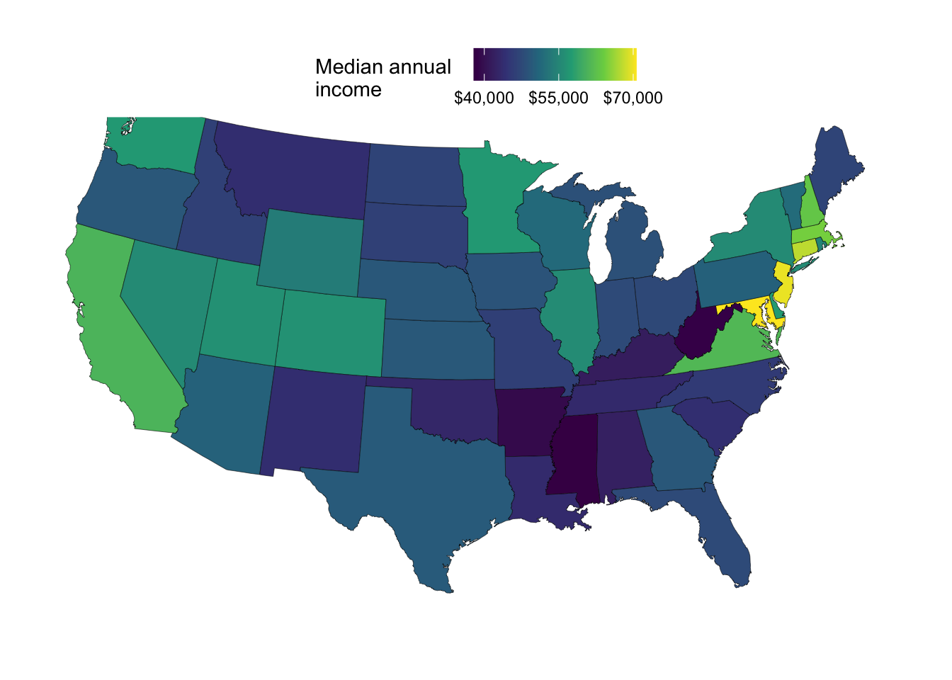
Or how about this color palette from the scico package?
p_income +
  scale_fill_scico(
    palette = "batlow",
    name = "Median annual  \nincome",
    labels = scales::label_currency(),
    breaks = c(40, 55, 70) * 1000
    )
Scale for fill is already present.
Adding another scale for fill, which will replace the existing scale.
Exercise 1
Create one or more maps similar to the map above showing median income, showing a different variable from the state_stats data. Pick one or more variables that look worth plotting to you, and let us know if you’ve found an surprising or otherwise interesting pattern!
You can also play around with data transformations, color schemes, etc., to make your map look better.
Click here for some hints
Relative to the code for the previous map, you’ll want to change what’s being mapped to the
fillaesthetic.You’ll also want to change the name of the legend.
Click here for an example
An example with the unemployment rate, which is in the column unempl.
ggplot(state_map_with_stats) +
  geom_polygon(
    aes(x = long, y = lat, group = group, fill = unempl),
    color = "black",
    linewidth = 0.1,
  ) +
  scale_fill_scico(
    palette = "davos",
    name = "Unemployment\nrate",
    # We can use `scales::label_percent()` to show % signs in the legend,
    # but we need to set its `scale` to 1 or values will be multiplied by 100:
    labels = scales::label_percent(scale = 1),
    # This is how we can draw a box around the legend color bar,
    # which is useful here because the scale goes into white:
    guide = guide_colorbar(frame.colour = "grey50")
    ) +
  coord_sf(crs = 5070, default_crs = 4326)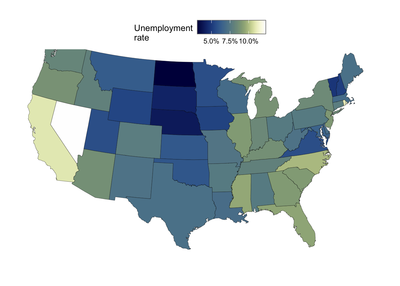
4 Interactive, zoomable maps with mapview
The mapview package allows you to easily make interactive maps where you can zoom in and out, turn layers on and off, and change the background map for the rendered map!
It is a more user-friendly but also more limited alternative to the leaflet package.
Using the example data from the package
For our first maps, let’s make use of breweries, an example dataset included with the package. This has the locations and some data about 224 breweries in the Bavaria region in Germany:
head(breweries)Simple feature collection with 6 features and 8 fields
Geometry type: POINT
Dimension: XY
Bounding box: xmin: 9.97323 ymin: 49.4208 xmax: 11.23872 ymax: 50.16198
Geodetic CRS: WGS 84
brewery address
1 Brauerei Rittmayer Aischer Hauptstrasse 5
2 Brauhaus Leikeim Gewerbegebiet 4
3 Ammerndorfer Bier Dorn-Braeu H. Murmann GmbH & Co. KG Marktplatz 1-2
4 Wittelsbacher Turm Braeu GmbH Wittelsbacher Turm 1
5 Arnsteiner Brauerei Schweinfurter Strasse 9
6 Aufsesser Brauerei Im Tal 70b
zipcode village state founded number.of.types number.seasonal.beers
1 91325 Adelsdorf Bayern 1422 2 1
2 96264 Altenkunstadt Bayern 1887 11 1
3 90614 Ammerndorf Bayern 1730 10 0
4 97688 Bad Kissingen Bayern NA 6 0
5 97450 Arnstein Bayern 1885 5 0
6 91347 Aufsess Bayern 1886 7 0
geometry
1 POINT (10.88922 49.71979)
2 POINT (11.23873 50.12579)
3 POINT (10.85194 49.4208)
4 POINT (10.07837 50.16197)
5 POINT (9.97323 49.9772)
6 POINT (11.22899 49.88405)Note that the format is different than what we’re used to. This is a so-called sf (short for Simple Features) geospatial object that is more advanced than the regular dataframes we’ve been working with (though note that ggplot can also plot these with several specialized geoms!).
To make our first map, we can simply run the mapview() function with the breweries object as input:
mapview(breweries)In the map above, let’s try to:
- Zoom in and out (+ and - buttons in the top left)
- Change the background map layer (layer button below the zoom buttons)
- Hover over one or more brewery points
The default information that is shown upon hovering over a point seems to be the row number, but we can change that using the label argument. Additionally, we can make point color differ by some variable, such as the founding year of the brewery (founded):
mapview(breweries, zcol = "founded", label = "brewery")Note that this is not ggplot at all, or even based on ggplot, so the syntax is completely different. To explore your options, take a look at the help page (?mapview) or perhaps more usefully, the examples on the mapview webpage.
Using recent sightings data of Bald Eagles around Columbus
We can use the rebird package to download recent bird sightings that were submitted to Cornell’s Ebird citizen science project — for example, around Columbus in the last month:
sightings <- ebirdgeo(
  species = species_code("haliaeetus leucocephalus"),
  lat = 39.99,    # Get sightings centered around the latitude
  lng = -82.99,   # Get sightings centered around the longitude
  back = 30,      # Get sightings from now to 30 days back
  dist = 50,      # Get sightings in a ration of 50 km around the coords
  key = REPLACE_THIS_WITH_API_KEY
)
Bald Eagle (Haliaeetus leucocephalus): baleagLet’s take a look at the dataset:
head(sightings)# A tibble: 6 × 13
speciesCode comName sciName locId locName obsDt howMany lat lng obsValid
<chr> <chr> <chr> <chr> <chr> <chr> <int> <dbl> <dbl> <lgl>
1 baleag Bald Eag… Haliae… L629… Prairi… 2025… 1 40.0 -83.3 TRUE
2 baleag Bald Eag… Haliae… L407… 7714 S… 2025… 2 40.1 -82.9 TRUE
3 baleag Bald Eag… Haliae… L353… Scioto… 2025… 1 39.9 -83.0 TRUE
4 baleag Bald Eag… Haliae… L870… McKinl… 2025… 1 40.0 -83.1 TRUE
5 baleag Bald Eag… Haliae… L407… 13639 … 2025… 1 39.9 -82.5 TRUE
6 baleag Bald Eag… Haliae… L801… Hoover… 2025… 2 40.2 -82.9 TRUE
# ℹ 3 more variables: obsReviewed <lgl>, locationPrivate <lgl>, subId <chr>To use this data with mapview(), the best course of action is to transform our “regular” dataframe to a geospatial sf object type with st_as_sf() like so (in which we pass the names of the longitude and latitude columns to coords):
sightings_sf <- st_as_sf(sightings, coords = c("lng", "lat"), crs = 4326)Now, we can make our map, and we’ll color points by the number of eagles seen in a single observation (howMany column) and label the points (when hovering over them) with the observation date (obsDt column):
mapview(
  sightings_sf,
  zcol = "howMany",
  label = "obsDt"
)
Exercise 2
A) Can you figure out how to create a map like the one shown below, where the point size is also based on the number of birds seen?
As mentioned above, you can take a look at the help page (?mapview) and/or the examples on the mapview webpage.
Click here for some hints
This section on the mapview website shows an example of varying point size by a variable.Click here for the solution
To make points vary in size by a certain variable (column in your dataframe), you can use the cex argument in the same way as we’ve used the zcol and label arguments:
mapview(
  sightings_sf,
  zcol = "howMany",
  cex = "howMany",
  label = "obsDt"
)
B) (Bonus) Perhaps for a map like this, it would make sense to have satellite imagery as the default/only background, since it makes it easier to orient yourself on the landscape to figure out how you, too, may be able to see these eagles. Can you make such a map? You’ll also need to adjust the point colors or dark points will become nearly invisible.
Click here for an example solution
mapview(
  sightings_sf,
  cex = "howMany",
  label = "obsDt",
  map.types = "Esri.WorldImagery",
  # I'm chosing to use a single color for all points:
  col.regions = "cyan2"
)
5 Bonus content (at-home reading)
Detailed map backgrounds on static maps with ggmap
The ggmap package allows you to use base/background maps from sources like Google Maps and Stadia Maps in static (non-interactive) maps. Let’s install and load it first:
if (! require(ggmap)) install.packages("ggmap")Loading required package: ggmapℹ Google's Terms of Service: <https://mapsplatform.google.com>
Stadia Maps' Terms of Service: <https://stadiamaps.com/terms-of-service/>
OpenStreetMap's Tile Usage Policy: <https://operations.osmfoundation.org/policies/tiles/>
ℹ Please cite ggmap if you use it! Use `citation("ggmap")` for details.library(ggmap)Unfortunately, API keys are needed nowadays for any of the map sources. Google Maps would probably be the most interesting to use, but to obtain an API key from them, you need to provide credit card details (even if low-level usage is free).
Instead, we’ll use Stadia Maps — you’ll still need to create an account and then generate your own API key, but you won’t need to provide credit card details. For information on generating the API key, see this Stadia Maps page and this info from ggmap:
?ggmap::register_stadiamapsOnce you have your API key, “register” it as follows:
api_key <- "REPLACE_THIS_WITH_YOUR_API_KEY"
register_stadiamaps(api_key, write = TRUE)
Now, we can obtain Stadia Maps base maps using the get_stadiamap() function. We first have to define a “bounding box” (bbox =) with the coordinates that make up the corners of the rectangle containing the area you want to plot:
us_coords <- c(left = -125, bottom = 25.75, right = -67, top = 49)Then, we can obtain the map, and plot it:
base_states <- get_stadiamap(bbox = us_coords, zoom = 5, maptype = "outdoors")ℹ © Stadia Maps © Stamen Design © OpenMapTiles © OpenStreetMap contributors.ggmap(base_states) 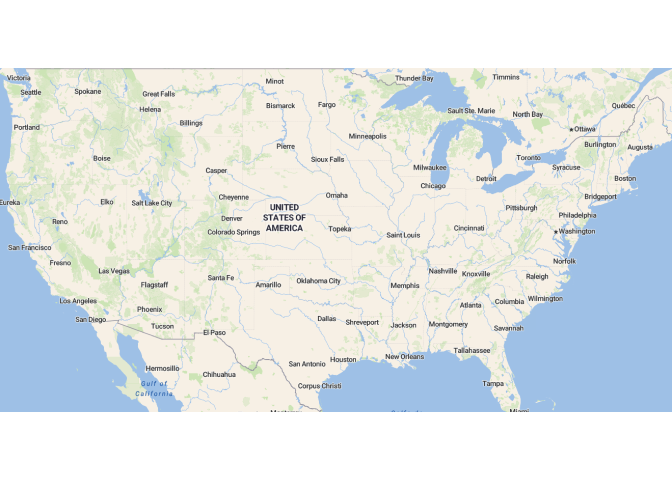
It makes sense to have plotting panel borders around these kinds of maps, so let’s update our theme:
theme_update(panel.border = element_rect(color = "grey20", fill = NA))Ohio map and maptype
As another example, let’s create a base map for Ohio — note that I am increasing the zoom level, which means we get a more detailed map and this is appropriate because we are now plotting a smaller area:
bbox_ohio <- c(left = -85, bottom = 38.3, right = -80.5, top = 42.2)

base_ohio <- get_stadiamap(bbox = bbox_ohio, zoom = 8, maptype = "outdoors")
ℹ © Stadia Maps © Stamen Design © OpenMapTiles © OpenStreetMap contributors.ggmap(base_ohio)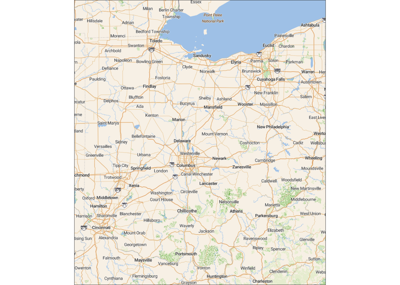
You can also play around with the maptype argument:
base_ohio <- get_stadiamap(bbox = bbox_ohio, zoom = 8, maptype = "stamen_toner_lite")ℹ © Stadia Maps © Stamen Design © OpenMapTiles © OpenStreetMap contributors.ggmap(base_ohio)
Adding points
To practice with adding points to such a map, let’s try to plot the Bald Eagle sightings data.
First, we’ll get a base map for the just area around Columbus (note the again increased zoom level):
bbox_columbus <- c(left = -83.6, bottom = 39.5, right = -82.1, top = 40.5)
base_columbus <- get_stadiamap(bbox = bbox_columbus, zoom = 9, maptype = "outdoors")
ℹ © Stadia Maps © Stamen Design © OpenMapTiles © OpenStreetMap contributors.Then, we can add the points like we have before:
ggmap(base_columbus) +
  geom_point(
    data = sightings,
    aes(x = lng, y = lat, fill = howMany, size = howMany),
    shape = 21,
    ) +
  scale_fill_viridis_c(name = "Number of Bald\nEagles observed") +
  guides(size = "none")
Warning: Removed 1 row containing missing values or values outside the scale range
(`geom_point()`).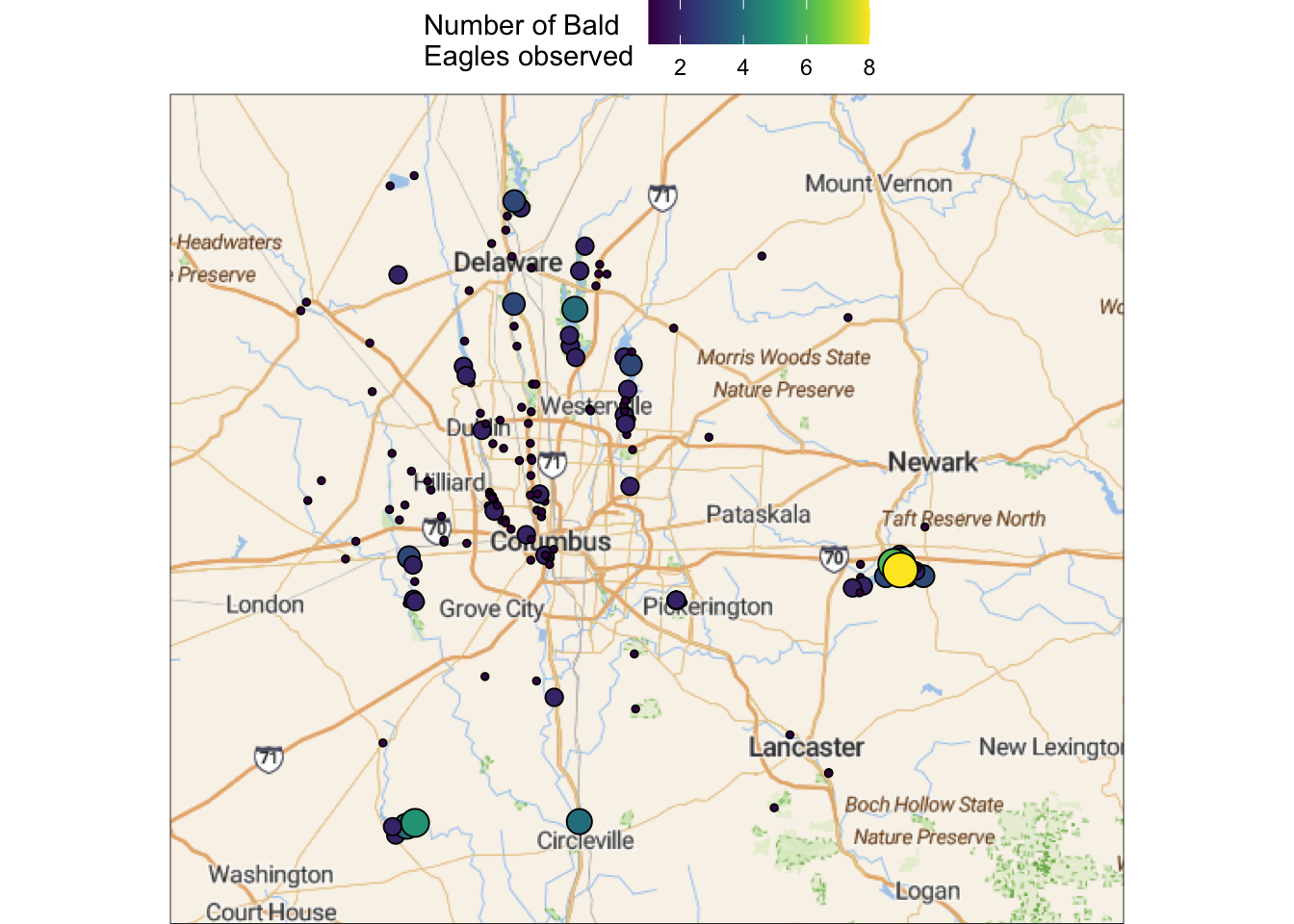
County-level choropleth maps
Base map
To plot some county-level maps for Ohio, we’ll grab the same county-level base map as last week using the map_data() function. We’ll also do some pre-processing so the column names are more intuitive, the county names are capitalized, and we only keep data for Ohio:
# County-level base map, filtered to just keep Ohio counties:
ohio_map <- map_data(map = "county") |>
  rename(state = region, county = subregion) |>
  mutate(county = tools::toTitleCase(county)) |>
  filter(state == "ohio") |>
  tibble()

head(ohio_map)
# A tibble: 6 × 6
long lat group order state county
<dbl> <dbl> <dbl> <int> <chr> <chr>
1 -83.7 39.0 2012 59960 ohio Adams
2 -83.6 39.0 2012 59961 ohio Adams
3 -83.4 39.1 2012 59962 ohio Adams
4 -83.3 39.1 2012 59963 ohio Adams
5 -83.3 39.1 2012 59964 ohio Adams
6 -83.3 39.0 2012 59965 ohio Adams Add county-level statistics
We’ll also use another dataset from the usdata package, this one is countywise and simply called county:
head(county)# A tibble: 6 × 15
name state pop2000 pop2010 pop2017 pop_change poverty homeownership
<chr> <fct> <dbl> <dbl> <int> <dbl> <dbl> <dbl>
1 Autauga County Alaba… 43671 54571 55504 1.48 13.7 77.5
2 Baldwin County Alaba… 140415 182265 212628 9.19 11.8 76.7
3 Barbour County Alaba… 29038 27457 25270 -6.22 27.2 68
4 Bibb County Alaba… 20826 22915 22668 0.73 15.2 82.9
5 Blount County Alaba… 51024 57322 58013 0.68 15.6 82
6 Bullock County Alaba… 11714 10914 10309 -2.28 28.5 76.9
# ℹ 7 more variables: multi_unit <dbl>, unemployment_rate <dbl>, metro <fct>,
# median_edu <fct>, per_capita_income <dbl>, median_hh_income <int>,
# smoking_ban <fct>View(county)?countyWe can filter this dataset to only keep Ohio data, and get rid of the County suffices to the county names:
ohio_data <- county |>
  filter(state == "Ohio") |>
  rename(county = name) |>
  mutate(county = sub(" County", "", county))
Let’s test whether the exact same set of counties is present in both dataframes using the setequal() function:
setequal(ohio_map$county, ohio_data$county)[1] TRUEGood! Then we’re ready to merge the dataframes, and we’ll do so in the same way as for the statewise data:
ohio_map_with_stats <- left_join(ohio_map, ohio_data, by = "county")

head(ohio_map_with_stats)
# A tibble: 6 × 20
long lat group order state.x county state.y pop2000 pop2010 pop2017
<dbl> <dbl> <dbl> <int> <chr> <chr> <fct> <dbl> <dbl> <int>
1 -83.7 39.0 2012 59960 ohio Adams Ohio 27330 28550 27726
2 -83.6 39.0 2012 59961 ohio Adams Ohio 27330 28550 27726
3 -83.4 39.1 2012 59962 ohio Adams Ohio 27330 28550 27726
4 -83.3 39.1 2012 59963 ohio Adams Ohio 27330 28550 27726
5 -83.3 39.1 2012 59964 ohio Adams Ohio 27330 28550 27726
6 -83.3 39.0 2012 59965 ohio Adams Ohio 27330 28550 27726
# ℹ 10 more variables: pop_change <dbl>, poverty <dbl>, homeownership <dbl>,
# multi_unit <dbl>, unemployment_rate <dbl>, metro <fct>, median_edu <fct>,
# per_capita_income <dbl>, median_hh_income <int>, smoking_ban <fct>Example maps
Population change from 2010 to 2017:
TipDiverging color scales
With a statistic like population change, which can take on both positive and negative values (and indeed does so in this particular case!), a “diverging” color scale can be useful. These have a “neutral” midpoint color and different colors for negative versus positive values.
See the example below, where I also set the midpoint to 0, because otherwise the scale centers around the midpoint in the data, which in this case was well above 0.
ggplot(ohio_map_with_stats) +
  geom_polygon(
    aes(x = long, y = lat, group = group, fill = pop_change),
    color = "black",
    linewidth = 0.2,
  ) +
  scale_fill_scico(
    palette = "bam",
    name = "Population\nchange",
    labels = scales::label_percent(scale = 1),
    breaks = c(-3, 0, 3, 6),
    midpoint = 0,
    guide = guide_colorbar(frame.colour = "grey50")
    ) +
  coord_sf()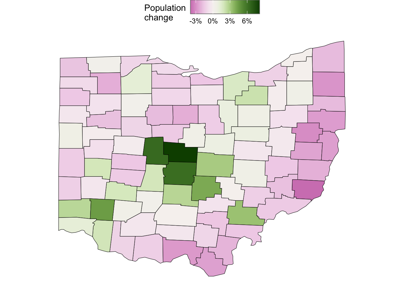
Median household income:
ggplot(ohio_map_with_stats) +
  geom_polygon(
    aes(x = long, y = lat, group = group, fill = median_hh_income),
    color = "black",
    linewidth = 0.2,
  ) +
  scale_fill_scico(
    palette = "imola",
    name = "Median house-  \nhold income",
    labels = scales::label_currency(),
    breaks = c(40, 70, 100) * 1000
    ) +
  coord_sf()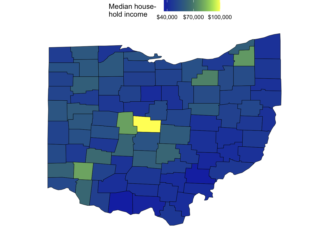
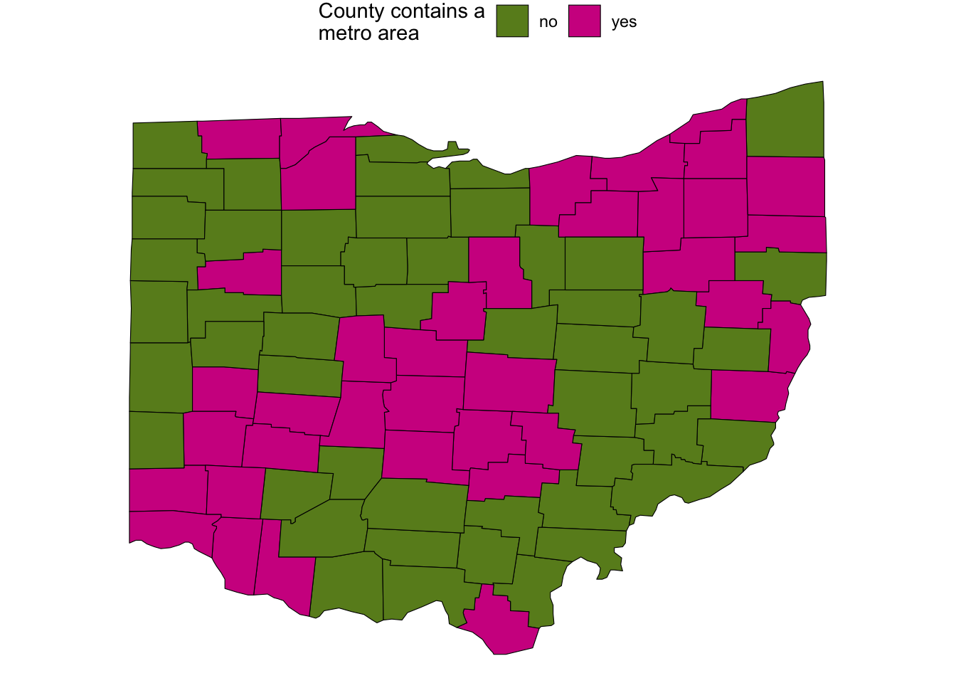
Whether the county contains a metropolitan area:
ggplot(ohio_map_with_stats) +
  geom_polygon(
    aes(x = long, y = lat, group = group, fill = metro),
    color = "black",
    linewidth = 0.2,
  ) +
  scale_fill_manual(
    values = c("olivedrab4", "violetred"),
    name = "County contains a\nmetro area"
    ) +
  coord_sf()