#import libraries used in the APP
#setwd("...map_data/") ### Please make sure to use your own working directory
library(shiny)
library(sf)
library(leaflet)
library(dplyr)
library(RColorBrewer)
library(htmlwidgets)
library(htmltools)
library(ggplot2)
library(bslib)
us <- st_read("data/map_data/OH_IN_PA.shp")
us <- us %>% filter(STATE_A=='OH'| STATE_A=='IN'| STATE_A =='PA') ### Ohio, Indiana, Pennsylvania
us <- st_transform(us, crs=4326)
class(us)
head(us)
plot(us[7])
# fist graph on ggplot = Income (boxplot)
inc_p <- ggplot(us, aes(x=STATE_A, y=med_ncm, fill=STATE_A)) +
geom_boxplot()
# second graph on ggplot = Temperature (densityplot)
temp_p <- ggplot(us, aes(x=tempmn, ..density.., fill=STATE_A))+
geom_density(alpha=0.5)
# third graph on ggplot = Population vs Development (scatterplot)
pop_p <- ggplot(us, aes(x=POPULAT, y=per_dev, color= STATE_A, size= med_ncm))+
geom_point()
#color palette for Temperature, Income and Population
temp_pal <- colorBin(palette="YlOrRd", domain=us$tempmn, bin=5)
pop_pal <- colorNumeric(palette= 'Purples', domain= us$POPULAT)
ncm_pal <- colorNumeric(palette= 'Greens', domain= us$med_ncm)
# Define UI for the APP
ui <- fluidPage(
theme = bs_theme(version = 4, bootswatch = "spacelab"), # theme from the library(bslib)
titlePanel(h1("Ohio, Indiana and Pennsylvania",align = "center", style = "color:#0d793e")), # Main title of the App use h1
br(),### break the line two times
br(),
tabsetPanel(#the tabset panel layout will include the three tab
# Tab 1: Data Exploration
tabPanel("Data explorer", # title of the first tab
br(),
fluidRow(
column(3,
selectInput(inputId = "countryInput1", #unique input ID
label= "Choose a State",
choices = unique(us$STATE_N),
selected = "Ohio"),
),
),
hr(),
DT::dataTableOutput("table") #output ID
),
#Tab 2: Visualization
tabPanel("Sum plots", #title of the second tab
br(),
sidebarLayout(#left section of the page used by the user to select input
sidebarPanel(
selectInput(inputId = 'inc_pop_temp',#unique input ID
label = 'Select a variable',
choices = c('',"Income", "Population vs Development", 'Median Temperature'), ),
),
mainPanel( # right section of the page
plotOutput("boxplot")#output ID
))),
#Tab 3: Interactive Map
tabPanel("Interactive Map", #title of the third tab
sidebarLayout(
sidebarPanel(#left section of the page used by the user to select input
selectInput(inputId = "countryInput", #unique input ID
label= "Choose a State",
choices = unique(us$STATE_N),
selected = "Ohio"),
selectInput(inputId = "varInput", #unique input ID
label= "Choose a variable",
choices = c("Temperature", 'Population', 'Income'))
,),
mainPanel(# right section of the page
leafletOutput("map", #output ID
width = "100%", height = "500px"))))
),)
# Define server logic
server <- function(input, output) {
selectedCountry1 <- reactive({#reactive expression for the Data Explorer
us[us$STATE_N == input$countryInput1, ] #match input of the user with the state name
})
selectedCountry <- reactive({ #reactive expression for the Interactive Map
us[us$STATE_N == input$countryInput, ] #match input of the user with the state name
})
output$table <- DT::renderDataTable({ #Data Explorer tab output
data = selectedCountry1()
})
output$boxplot <- renderPlot({ #Visualization tab output
if (input$inc_pop_temp %in% "Income") # If input of the user is Income
{inc_p} #then print Income graph
else if (input$inc_pop_temp %in% "Median Temperature")# If input of the user is Median Temperature
{temp_p} #then print Temperature graph
else if (input$inc_pop_temp %in% "Population vs Development")# If input of the user is Pop vs Dev
{pop_p} #then print Pop vs Dev graph
})
output$map <- renderLeaflet({#Interactive Map tab output
leaflet('map', #base map
options = leafletOptions(zoomControl= FALSE)) %>%
htmlwidgets::onRender("function(el, x) {
L.control.zoom({ position: 'topright' }).addTo(this)
}") %>%
addTiles(group = "OSM") %>%
addProviderTiles("Esri.NatGeoWorldMap", group="ESRI") %>%
addProviderTiles("CartoDB.DarkMatter", group= "CartoDB") %>%
addLayersControl(baseGroups = c("CartoDB","OSM", "ESRI")) %>%
addLegend(position="bottomright", pal=temp_pal, values=us$tempmn, title="Temperature")%>%
addLegend(position="bottomright", pal=pop_pal, values=us$POPULAT, title="Population")%>%
addLegend(position="bottomleft", pal=ncm_pal, values=us$med_ncm, title="Income in $")%>%
setView(lat= 39, lng=-80, zoom=6)
})
observe({#observer
state_popup <- paste0("<strong>County: </strong>", #popup
selectedCountry()$NAME,
"<br><strong> Temperature: </strong>",
round(selectedCountry()$tempmn,1),"℃",
"<br><strong> Median Income: </strong>",
selectedCountry()$med_ncm,'$',
"<br><strong> Population: </strong>",
selectedCountry()$POPULAT)
high_opt <- highlightOptions(weight = 3, color = "white", bringToFront = FALSE) #highlight when user select county
if (input$varInput %in% "Temperature") {
leafletProxy("map", data = selectedCountry()) %>%
#understand when to clearshapes
# clearShapes() %>%
addPolygons(fillColor = temp_pal(selectedCountry()$tempmn),
popup = state_popup,
col="#302E2D",
fillOpacity = 1,
weight = 1,
highlight = high_opt )
}
else if (input$varInput %in% "Income") {
leafletProxy("map", data = selectedCountry()) %>%
#understand when to clearshapes
# clearShapes() %>%
addPolygons(fillColor = ncm_pal(selectedCountry()$med_ncm),
popup = state_popup,
col="#302E2D",
fillOpacity = 1,
weight = 1,
highlight = high_opt )
}
else if (input$varInput %in% "Population") {
leafletProxy("map", data = selectedCountry()) %>%
#understand when to clearshapes
# clearShapes() %>%
addPolygons(fillColor = pop_pal(selectedCountry()$POPULAT),
popup = state_popup,
col="#302E2D",
fillOpacity = 1,
weight = 1,
highlight = high_opt )
}
})
}
shinyApp(ui = ui, server = server)Shiny 03: Map viz. in Shiny
Explore maps in Shiny App.
Welcome to our shiny app development class! Throughout this session, Dr. Sandip Mondal will walk us through a case study to generate interactive maps using shiny app.
1 Shiny App to visualize maps.
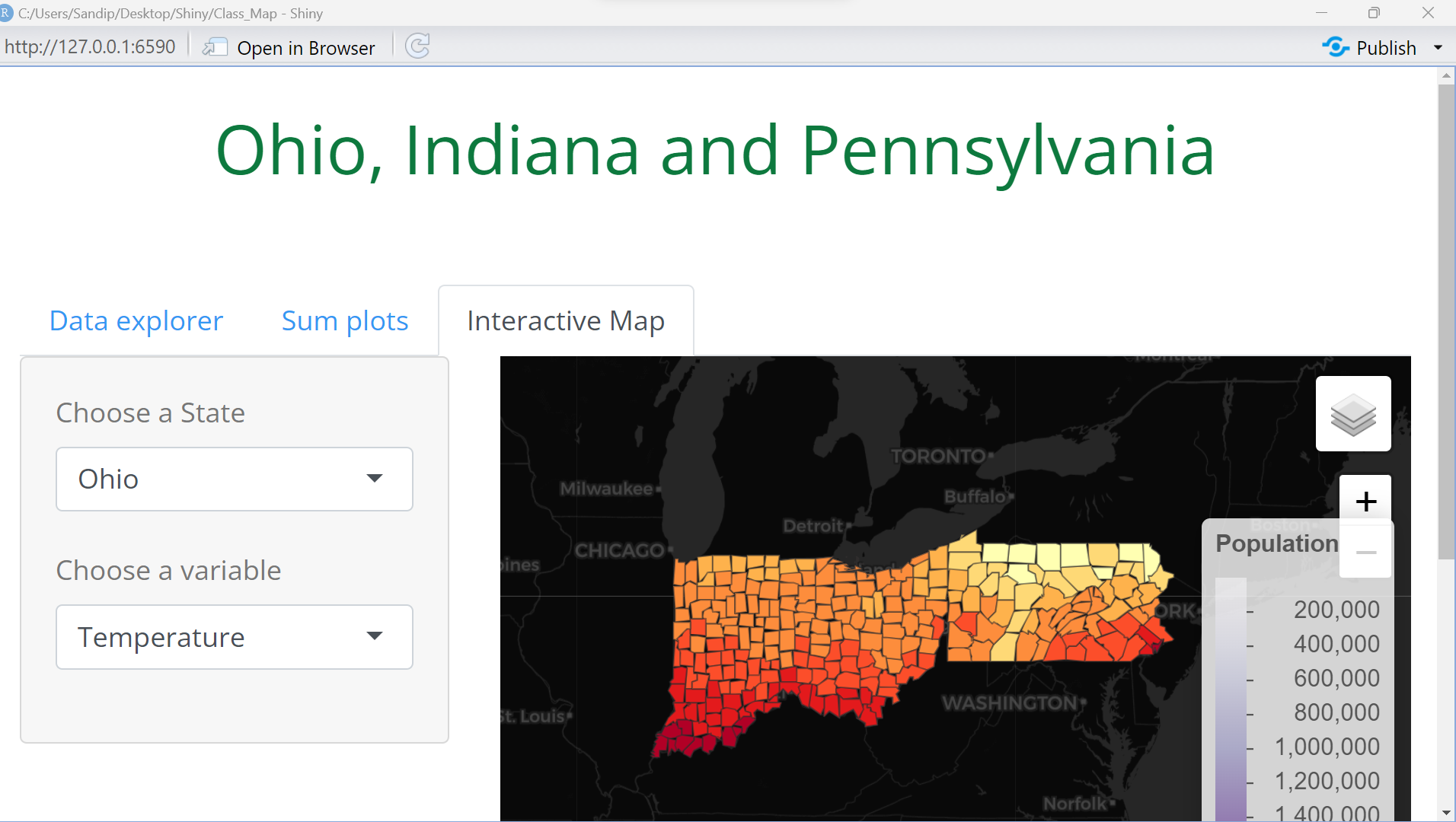
To follow step-by-step what we will cover today in class, please refer to this Shiny App.
Dataset description: This dataset was created by Prof. Maxwell for use in his courses. A variety of attributes have been summarized at the county-level. A total of 3,104 records are provided representing the majority of the counties in the contiguous United States. A few counties were excluded due to their small size.
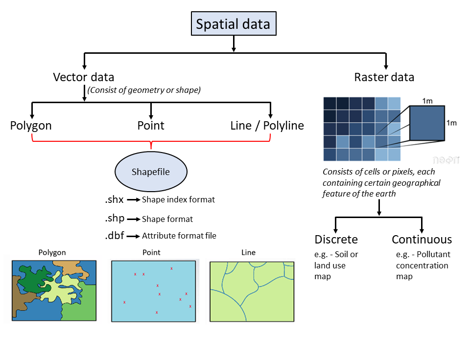
2 Types of Spatial Data.
There are two types of spatial data: vector and raster. Below is a graphical explanation of these data.
3 What do we expect to achieve by the end of this tutorial.
Today we will start with the output, understand the components of the shiny app and what we want achieve.

4 Building our Shiny App.
Let’s make a shiny app and see how this works!
First download the following files and set it to a working directory.
